Along with April and May the months of September and October are actually my most favorite of the entire year. The heat finally breaks, the nights are getting cooler, and most importantly the tourist zombie armies have finally returned to their respective icy enclaves in the North. Prices across the board are dropping as well, so it’s a perfect time to plan a late summer or early fall vacation. Life is good – until November when I get to complain about too much rain and cold feet again.
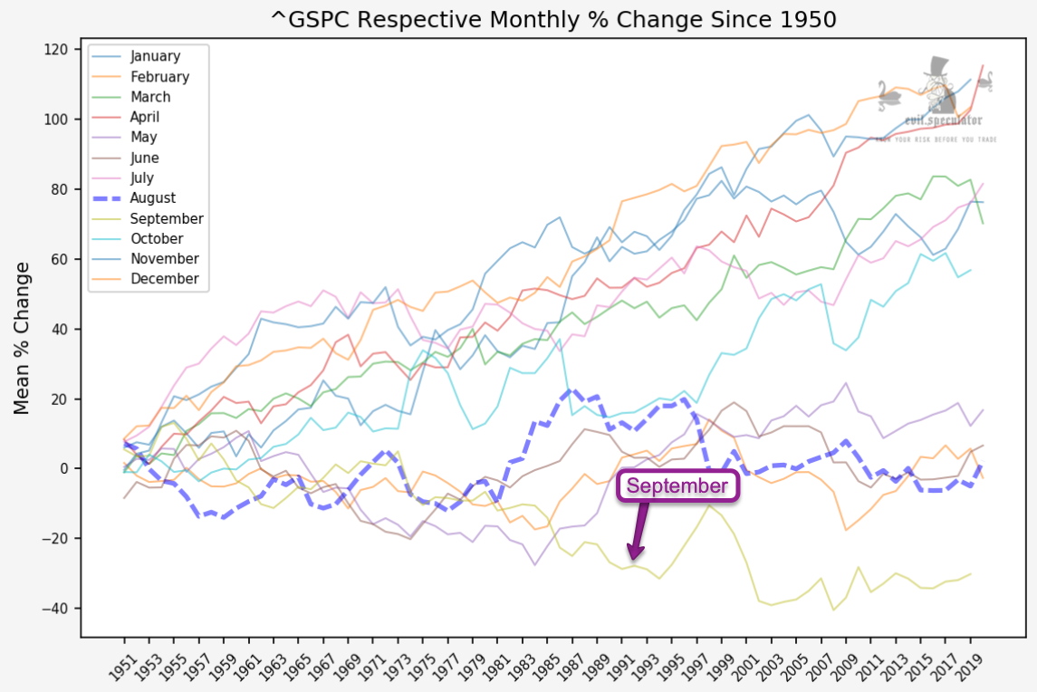
When it comes to the financial markets however bad things tend to happen in September, at least historically speaking. Apologies in advance for August highlighted in those monthly charts but my automated script won’t roll over until tomorrow.
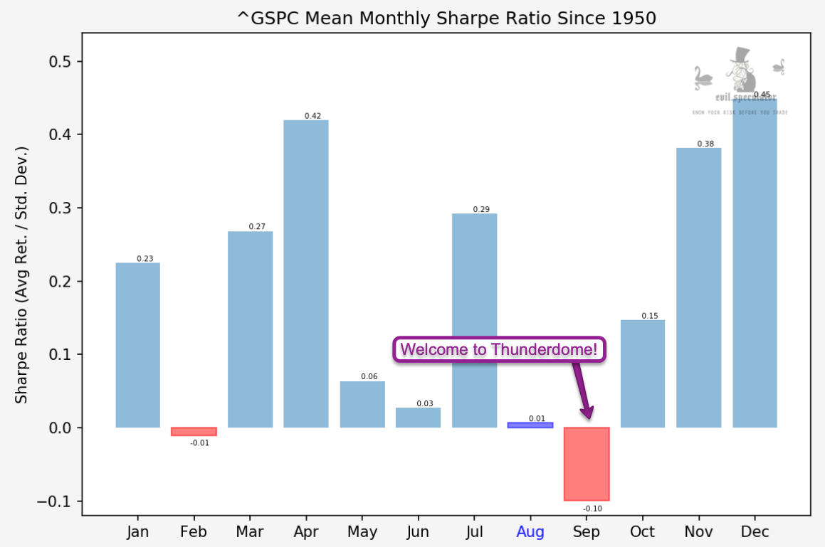
With a Sharpe ratio of -0.10 September is by FAR the most bearish of the month. But given that we are in a raging bull market will things be different in 2020? Let’s pop open the hood and dig a little deeper:
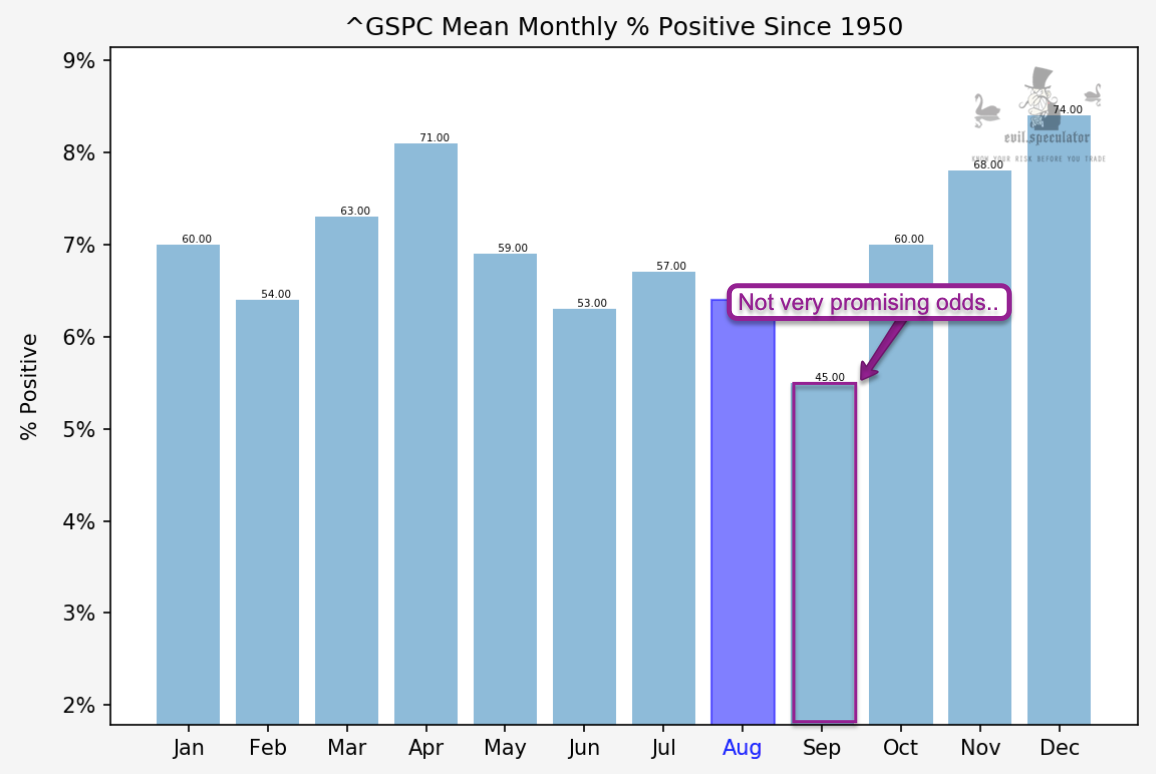
Percent positive odds for September are by far the worst of the year at 45%. Very surprisingly it’s 60% for October which is commonly associated with market crashes. As a whole and counting some of its negative outliers October however is a much better month.
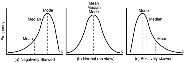
SKEW basically tells us about the leanings of the data distribution. Before I spend an hour explaining this again, here’s a picture that should make it abundantly clear:
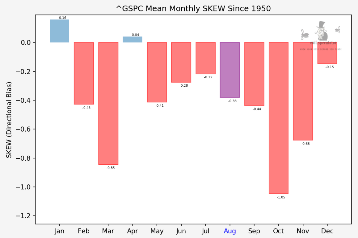
A negative SKEW reading means that the median is leading the mean (or the mean is lagging the median), which in turn means that the negative months are mostly outliers.
So while September is a negative month it appears that the biggest losing months are in the outliers. If that is confusing to you then remember that even a dataset with only negative values can have a negative SKEW. Hope this makes sense.
[MM_Member_Decision membershipId='(2|3)’]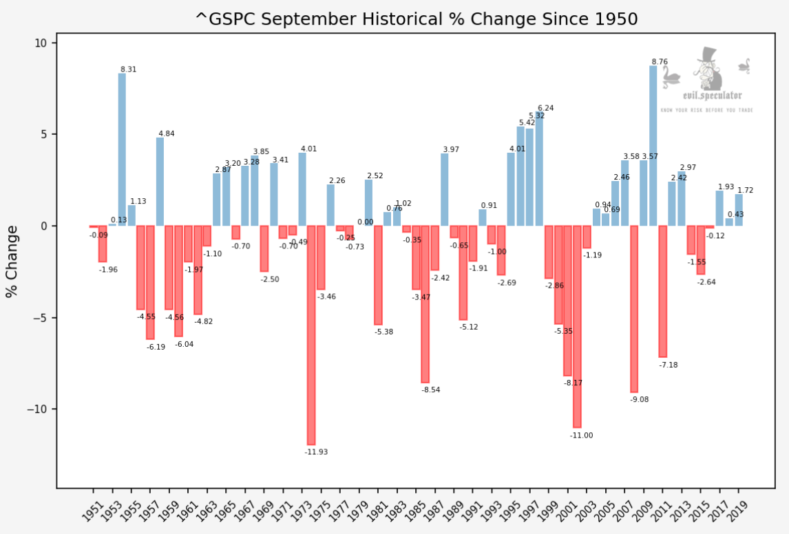
And looking at the historical change chart the reason why September sucks statistically is becoming abundantly clear. The one big take away from looking at this dataset is that WHEN things go bad they usually swing for the fences. That said, things have gotten a bit more mellow over the past decade since the introduction of large scale recurring quantitative easing.
Here’s September only plotted as its own graph in comparison with all other months of the year. Again apologies for highlighting the wrong month but I would have had to rewrite my entire script.
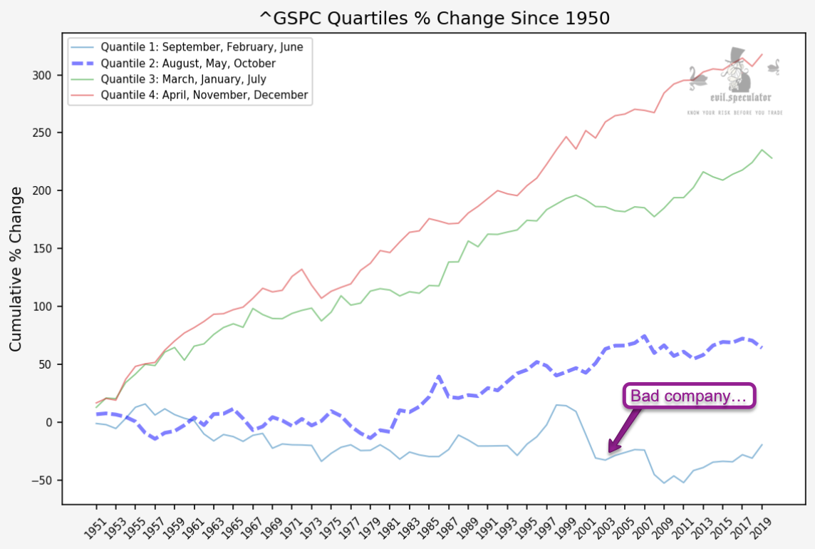
Either way, if you had invested only during September since 1950 you would be broke several times over.
Not surprisingly September is in pretty ‘bad company’ along with chilly February and do nothin’ June.
Hey but at least it’s got good weather!!
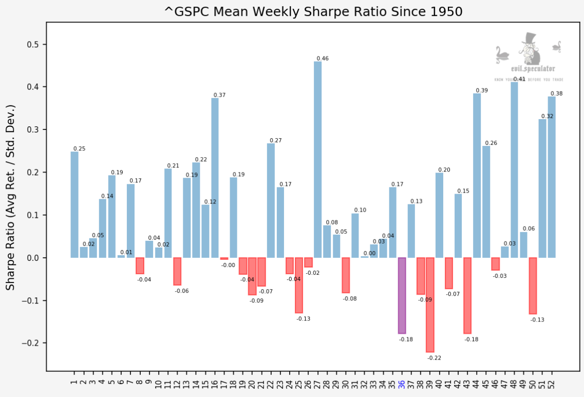
Here are the Sharpe stats for week #36 which begins today. Not looking so hot with a Sharpe of -0.18 and after a brief repose next week things tend to get even uglier – at least historically speaking. 2020 will most likely be remembered as the outlier of the early 21st century so who knows, maybe this year we don’t skip a beat and just power higher.
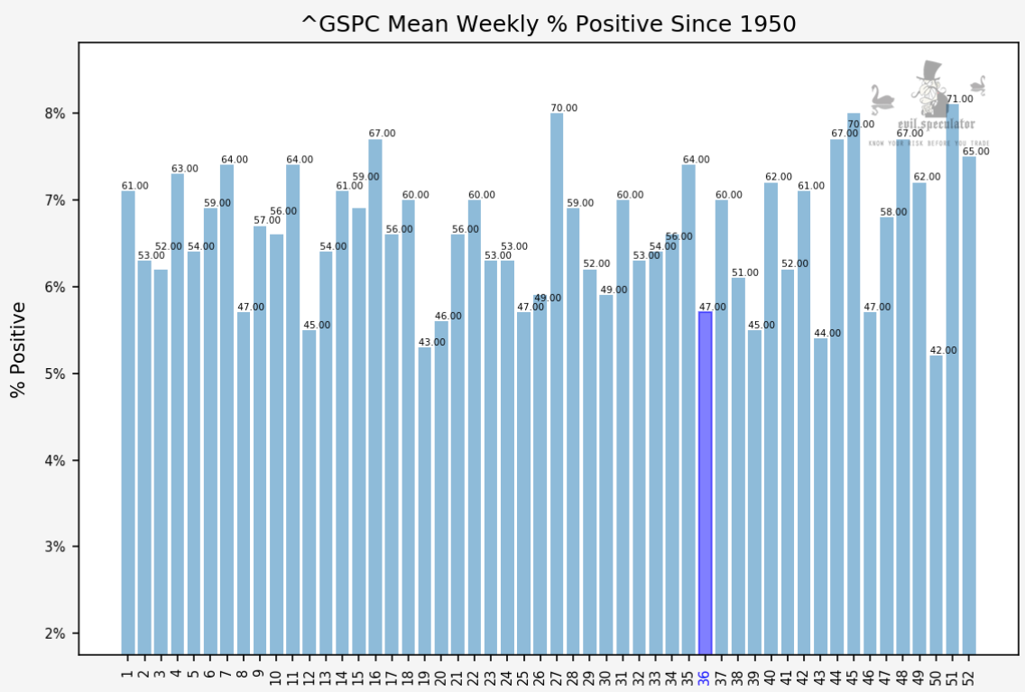
Weekly percent positive at 47%. Not the worst of the year but definitely in the lower rungs.
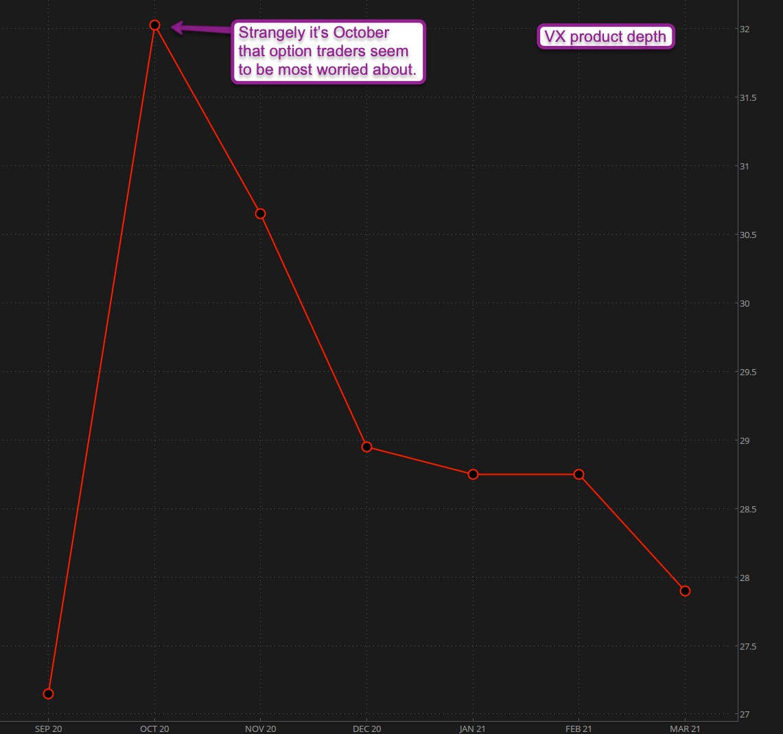
VX Product depth however continues to point at October for possible trouble. This of course also relates to the fact that the front month during September usually is October. So maybe not so ‘strange’ after all 😉
[/MM_Member_Decision] [MM_Member_Decision membershipId=’!(2|3)’] Please log into your RPQ membership in order to view the rest of this post. Not a member yet? Click here to learn more about how Red Pill Quants can help you advance your trading to the next level.[/MM_Member_Decision] [MM_Member_Decision isMember=’false’] Please log into your RPQ membership in order to view the rest of this post. Not a member yet? Click here to learn more about how Red Pill Quants can help you advance your trading to the next level.
[/MM_Member_Decision]

