I’d wager that the majority of retail traders chose to listen to the onslaught of bearish siren calls peddled in the MSM over the past two months, once again causing them to miss out on yet another massive push to the upside.
As we’ve now advanced all the way into new all time highs you may wonder if at least an obligatory shake out may be in sight. Let’s see what my market momentum charts have to say about it.
Let’s start with Mr. VIX – despite all time highs the 12 mark has yet to be broken and IMO the bulls require a drop < the 11.8 mark in order for the rising trendline above to be broken.
There are of course no iron clad rules that were handed down to Moses about any of this. But it has become clear now that we have built a new IV base over the past two years and investor confidence is needed in order to abandon the high volatility market regime that has reigned since early 2018.
[MM_Member_Decision hasBundle=’1|2|3′]
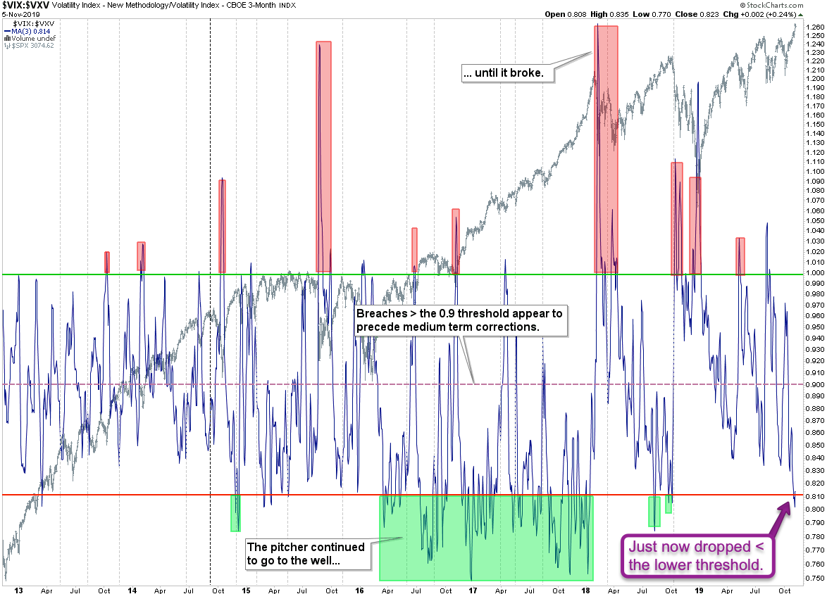
The implied volatility term structure, a.k.a. the VIX:VXV or VIX:VIX3M, has dropped into its traditional reversal range < 0.81. Usually it takes a spike higher followed by a breach > the 0.9 mark for bearish forces to take hold.
Note that this dynamic was completely suspended during the period of spring of 2016 and late 2018. We seem to be ‘back on track’ but I wouldn’t base a short campaign in equities just on that, especially given the current seasonality.
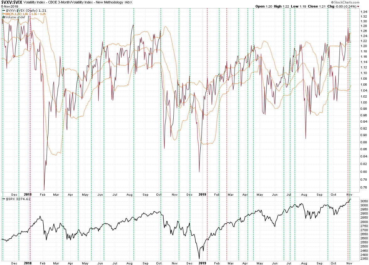
Same ratio but inverted (VXV:VIX) – this has been a pretty reliable indicator in the past but it’s not infallible (see the red vertical lines). As this chart is a bit more short term ensuing corrections are also usually more shallow.
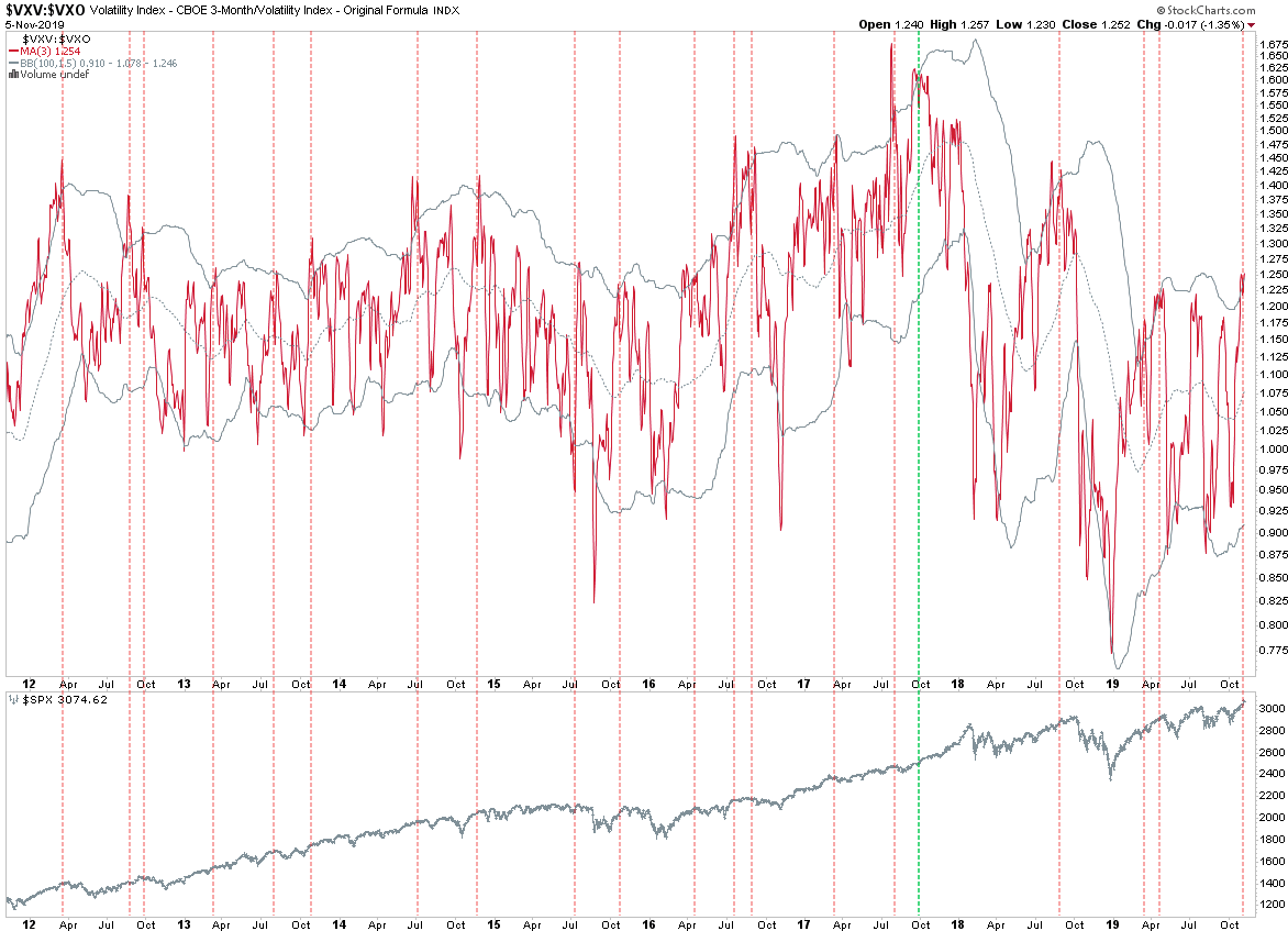
VIX vs the VXO (i.e. the ‘old’ VIX) – again a bit more long term but also not infallible – this seems to be less accurate in high volatility market regimes. I’d say we let price confirm any bearish ideas before resorting to short positions.
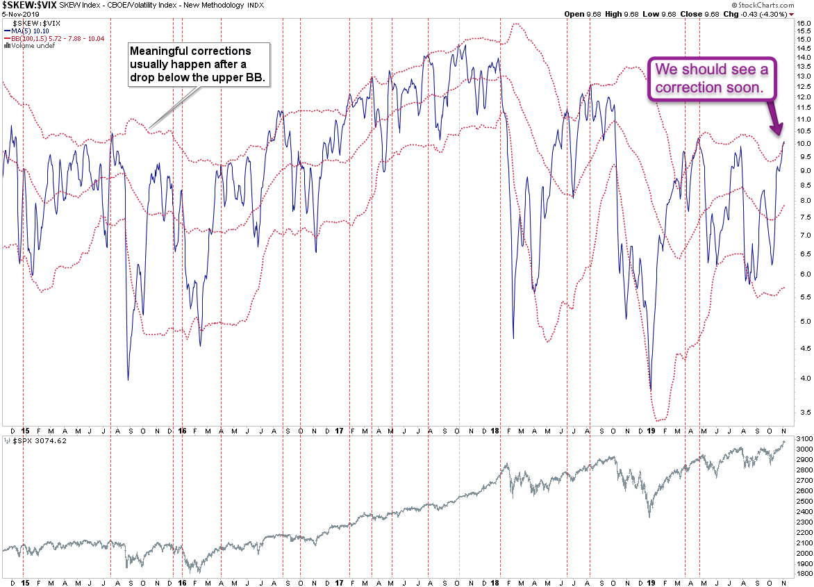
CBOE SKEW vs. the VIX – another ratio that’s suggesting a small correction in the next month or so, which means we could easily Christmas or NYE until we see any fireworks.
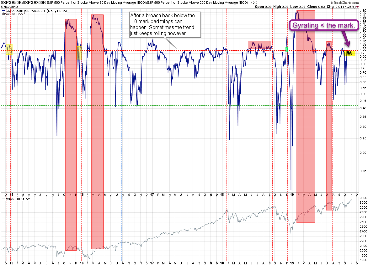
SPX market breadth on the other hand seems to disagree with all this bearishness and tells us to just chill out and enjoy the ride.
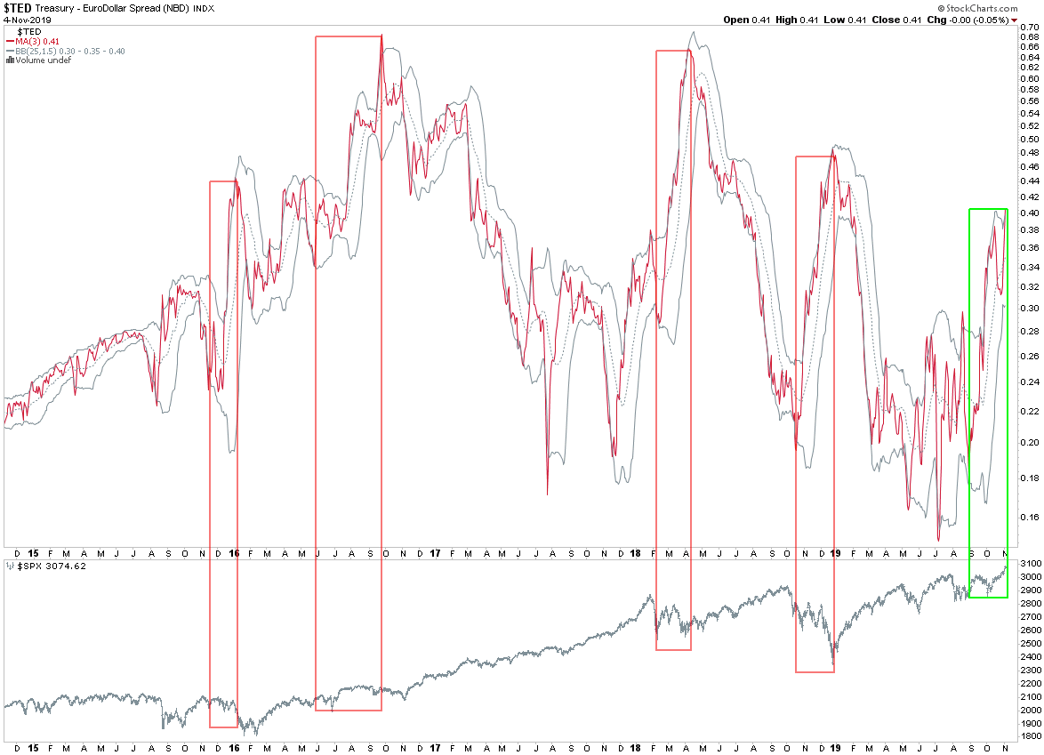
The TED spread is the difference between the three-month Treasury bill and the three-month LIBOR based in US dollars. To put it another way, the TED spread is the difference between the interest rate on short-term US government debt and the interest rate on interbank loans.
I don’t get an equities related read on this but just wanted to point out something interesting. Note how sudden spikes have in the recent past been accompanied by either sideways tape or downright corrections? Except this time which probably has a lot to with the Fed’s new POMO adventures.
Words To The Unwise
One of my charts above muses that the pitcher goes to the well… until if breaks of course (per the old expression). Seems like the Fed figured out that if the pitcher breaks you just need to get yourself a damn new pitcher.
[/MM_Member_Decision]
[MM_Member_Decision membershipId=’!(1|2|3)’]
Please log into your RPQ membership in order to view the rest of this post.
[/MM_Member_Decision]


